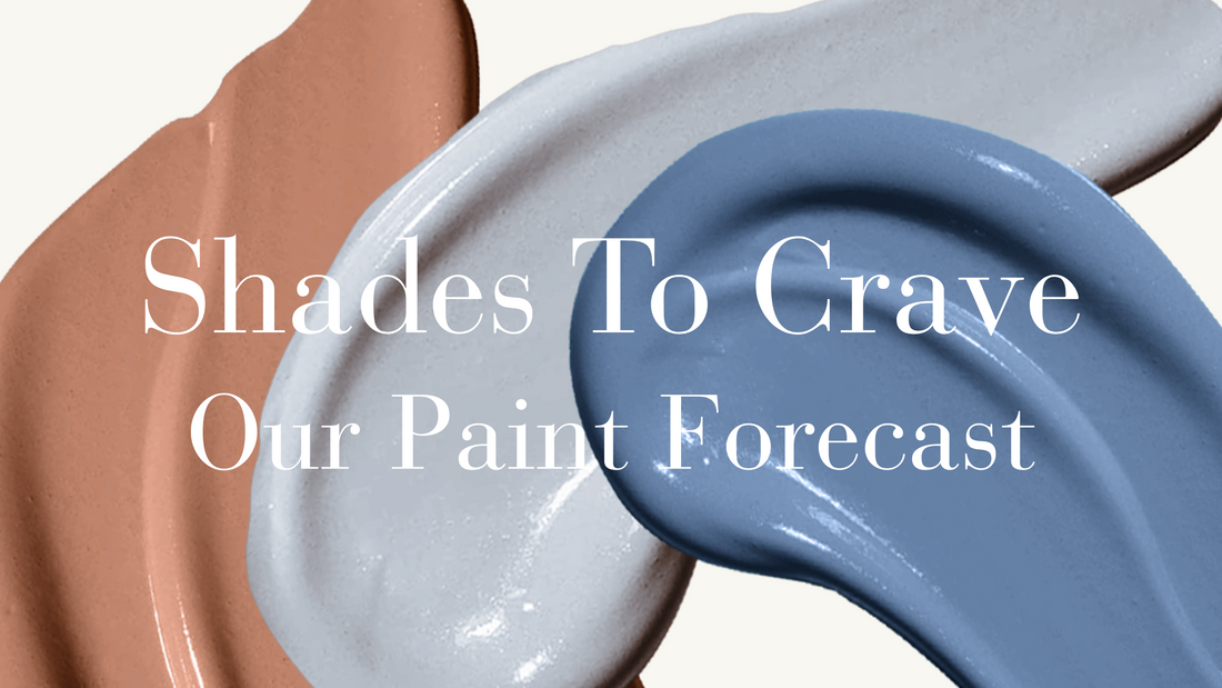
Shades To Crave: Our Paint Forecast
When it comes to redecorating and planning your home interior, picking the right paint to go on your walls is a crucial part of it, because with colour, you set the whole mood. But, let's be honest... It can also be incredibly stressful! You think you've settled on the right colour, and the next thing you know, you're surrounded by 10 slightly different shades of the same colour and questioning everything.
Don't worry! Today, we're here to showcase some of our favourite colour trends of 2025, particularly the colours that will be mainstay choices into 2026 too. But guess what? We've also got the first look at the paint colour forecast for next year, so if you really want to be ahead of the curve where interiors are concerned, we've got you sorted!
Shades Here To Stay
No, don't panic, a refresh in home decor trends doesn't mean you have to panic and repaint your whole house! It's all about staying in touch with your taste and having fun, and luckily, there's a couple of colours that aren't going anywhere fast!
Matcha's Moment Isn't Over!
You’ve probably seen it everywhere; from walls to wardrobes to your latte order; matcha green has officially taken root in 2025, and it looks like it's here to stay into 2026! This soft green feels earthy and fresh all at the same time; making it an ideal wall colour for homes craving a sense of calm without dullness. So, if you're loving green at the moment, don't worry, cool matcha is here to stay! Our 'Park Life' shade perfectly captures that cool matcha tone, feeling deeply relaxing and trendy at the same time. Style tip: pair with natural wood and rattan to really elevate that natural vibe, or pair it with sleek black tones for a modern feel.

We're Picking Up Good Intentions
Versatile, calming and oh-so-sleek, greys and taupes have always been a mainstay in home decor trends, and spoiler alert: they're not going anywhere anytime soon! They exude elegance and maturity without feeling dull, especially when you go for the right sort of shade. Take a look at our 'Good Intentions' paint; it feels like a total breath of fresh air, but it’s cosy enough to make any room feel like home. Check out how it's been used in a kitchen setting below, and how well it compliments those bolder wall tiles! It just goes to show that neutrals don't have to be boring when you pair them with unique decor touches like brighter accents or even a little bit of sparkle!

Get Ahead Of The Curve!
We've got intel on the colour schemes that will take the home decor world by storm. They may seem a little wild right now, but if you want to get ahead of the trends, take a look at our picks that will soon be everywhere!
Wine-Not Try This?
Sure, it might feel intense compared to your usual neutrals, but that’s exactly why deep rich reds work. They add drama, warmth, and a sense of luxury which pair beautifully with sparkling gold accents. The key? Embrace it! Whether you go all in with four walls or use it as a contrasting statement wall, this colour has serious staying power. And once you see how it instantly elevates a space, you’ll wonder why you didn’t try it sooner! Take a look at our favourite deep burgundy; 'Smith and The Devil', an absolutely perfect example of the richness of red when it comes to your home

Yellow, Gorgeous!
Vibrant yellow is absolutely a colour to watch, and why not! It's absolutely captivating, bringing an easy sense of fun, happiness, and an undeniable vibrancy. It doesn't matter if you’re into playful retro vibes or clean, contemporary spaces, this kind of yellow will immediately brighten up any space. Use 'Ziggy's Yellow' to energise a kitchen, a hallway, or create a bold feature wall that practically smiles at you! The takeaway? Don’t sleep on yellow; it’s the fearless pop your home will thank you for in a few months!

Apricot & Terracotta Had a Baby… And It’s Gorgeous!
Apricot, terracotta, peach — whatever you call it, this is the warm-tone trend that's about to take over. Enter: 'Spanked', a juicy, modern terracotta shade that’s got just the right mix of quirky energy and laid-back cool. It’s softer than a dark terracotta, but bolder than a plain peach; basically, it brings serious personality without overwhelming your space. This tone is perfect for those who want something warm and welcoming but with a fresh, modern twist!

Stun With Sapphire
Moody, rich, and dripping in sophistication, deep sapphire blue is our next colour making a major statement, and 'Blue Blood' isn’t your average navy. It’s bold, it’s dramatic, and it instantly elevates a room with that coveted high-end feel. This regal shade is predicted to be one of the most-loved colours in homes that aren’t afraid to go bold. Pair it with brushed brass, marble, or soft velvets for a luxury look that’s pure interior goals!

Ready To Make a Splash?
It doesn't matter if you're playing it safe with timeless tones that are staying trendy, or diving headfirst into bold, trend-setting shades, we've got you covered with paint; quite literally! Our paint picks are here to help you stay ahead of the curve and bring serious style to your walls. So why wait for the trend to hit? Be the one setting it! Explore the colours everyone’s about to be obsessed with and give your space the glow-up it deserves. Let’s get painting!
Want to see even more colours? Check out our full range of Paint and Wallpapers!
Leona Franke